CLEVELAND — With a new hospital comes a new logo, and this one has meaning.
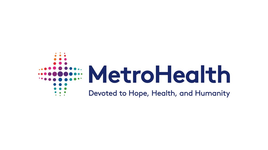
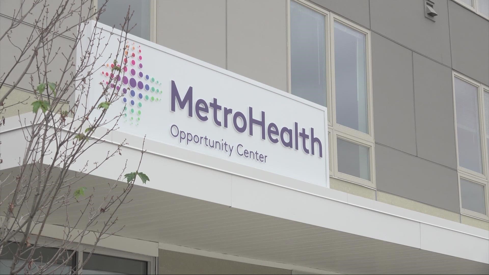
MetroHealth recently updated its branding with the opening of the state-of-the-art Glick Center, symbolic of the hospital system's ongoing transformation. Gone is the blue interlocking "MH" that had been so familiar to Northeast Ohio, and in its place comes a revised medical cross meant to reflect Metro's vision.
The cross was initially used by, appropriately, the Red Cross as a beacon for inclusive, non-biased medical care and as a universal symbol of aid and comfort. Metro's symbol puts a new spin on things, as it is composed of a series of colorful dots that symbolize the diversity and inclusivity of the Greater Cleveland community and MetroHealth team.


Overall, the logo is meant to reflect the Metro's contributions and advanced thinking that inspire change. The system's new tagline is, "Devoted to hope, health, and humanity."

