CLEVELAND — Editor's note: the video in the player above is from a previous story.
Beginning next season, the Cleveland Indians will have a new name. But while the franchise announced on Friday that it will be known as the "Guardians" following the 2021 campaign, it didn't take long for fans to take to social media to note the similarities between their favorite baseball team's current name and its future one.
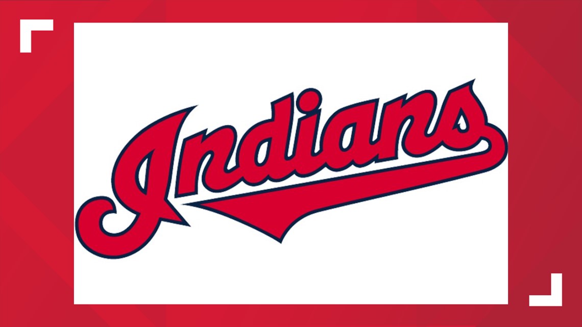
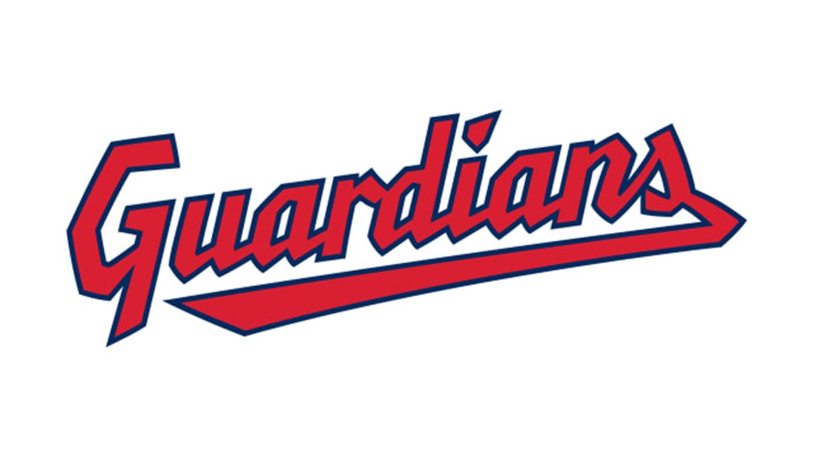
For starters, both "Indians" and "Guardians" end in the same five letters. Intentionally or not, that's helped make it so that the Indians' current script wordmark looks similar to the Guardians' script, even though they feature different fonts.


Similarities also exist between the Indians' and Guardians' block-lettered "CLEVELAND" wordmarks.

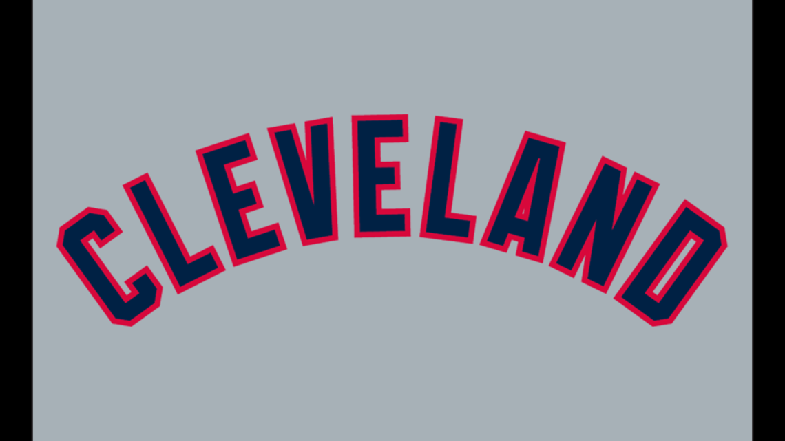

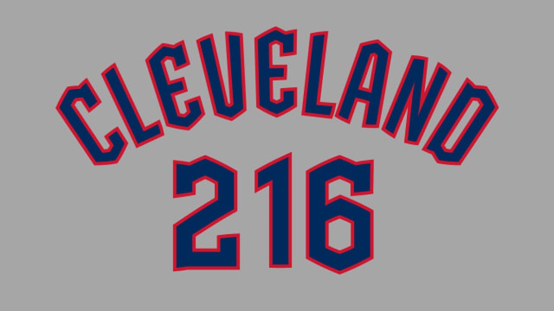
Additionally, the Guardians' will be maintaining the franchise's red, white and navy blue color scheme, which it has used for more than 80 years. The Guardians will also continue to wear their script name font on their white home uniforms and "Cleveland" in navy blue font with red trim on their gray uniforms.
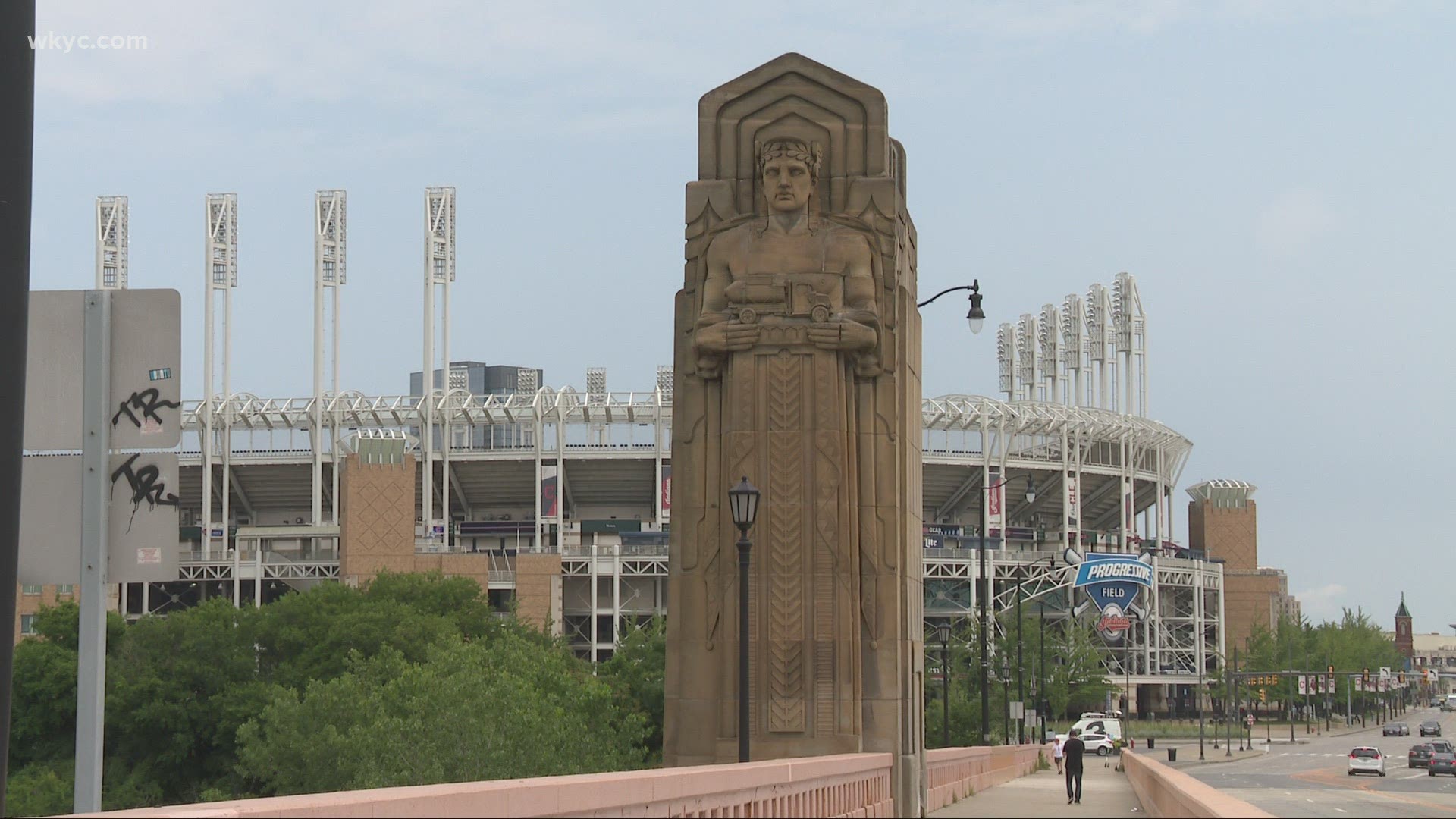
As for their caps, the Guardians' will maintain a 'C' logo, although rather than the Indians' block 'C' font, it will use a new 'Diamond' C derived from the Guardians' Bridge Print alphabet. According to a release: "the new C stands tall – just as the Guardians of Traffic stand watch over our ballpark and city – and draws from the ascending diamond motifs at the top of each Guardian pylon. The weight of the C is bold and its tapered shape is inspired by letterforms from the 1920 and 1948 World Series clubs."
As for the reaction to the new name, it appears to be somewhat split. But regardless of one's feelings, many seem to agree that "Guardians" is hardly a drastic departure from "Indians," as evidenced by the creativity -- or lack thereof -- on social media.

